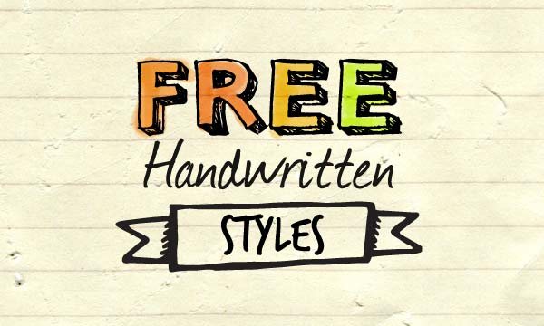
Hand-drawn look and feel
It’s easy to create a hand-drawn look and feel in your designs using free resources from around the web. Graphic designers use a few common elements to achieve this effect. Here is a look at the most common elements of handwritten graphic design.


Notebook and paper textures
Handwritten designs look great with a notebook or paper background if you’re looking for a “sketchbook” kind of look.
More free paper backgrounds and textures
- Seamless notebook and paper backgrounds
- Free paper textures
- 100 high quality large notebook textures
- Folded paper overlays (costs $5)
Handwritten fonts
There are heaps of handwritten fonts available for free if you don’t feel like drawing your own.
3D handwritten fonts
Colour outside the lines
If you’re colouring in lined work, don’t make it perfect. If you’re using a paintbrush tool in Photoshop or similar, try and get some colour outside the lines. Messy is nice and realistic.
For a more dynamic and realistic effect, try setting the opacity of your paintbrush to a lower setting, such as 50%, and try going over sections more than once. This gives the impression of varying weights, just like a real marker pen.
Irregular shapes
Keeping on the theme of imperfection, avoid perfect shapes and lines. If you want your shapes to look realistically hand-drawn, try adding blemishes such as irregular shapes, repeating strokes and varying stroke width.

Perfect circles don’t look hand-drawn. Try deliberately adding imperfections such as varying stroke width and repeated strokes.
Free hand drawn vector shapes
Free stationery vectors
More handwritten graphic design tips
There is a wealth of resources available for free to create a hand-drawn design. Got any handy tips for replicating this style? Let us know in the comments!


